
Lightdash now offers Custom Charts, enabling more advanced and customizable visualizations using the powerful Vega-Lite library. This unlocks the potential to go beyond standard chart types, letting you create visualizations like heatmaps, box plots, maps, and more.
What is Vega-Lite?
Vega-Lite is a high-level grammar of interactive graphics, built on top of the lower-level Vega visualization grammar. It allows users to define visualizations with concise JSON syntax, similar to Plotly or ECharts. At its core, Vega-Lite enables you to describe how your data should be transformed and displayed by combining:
- Mark types: bar, line, point, area, tick, box plot, etc.
- Encodings: mapping data fields to visual properties such as position (x, y), color, size, shape, and tooltip.
- Transformations: filtering, aggregation, binning, and calculated fields.
- Layout and composition: layering, repeating, and faceting.
For example, a simple bar chart in Vega-Lite might look like this:
{
  "mark": "bar",
  "encoding": {
    "x": {"field": "category", "type": "nominal"},
    "y": {"field": "amount", "type": "quantitative"}
  }
  }
Using Custom Charts in Lightdash
The custom chart feature in Lightdash gives users access to the full expressiveness of Vega-Lite visualizations.
Getting Started
To build a custom chart in Lightdash:
- Return the Data: Use the Lightdash UI to select the dimensions and metrics you want in your chart. Execute the query as you would for any standard visualization.
- Configure the Chart: In the chart options dropdown, select “Custom chart.” Here, you can enter a Vega-Lite JSON configuration to define your visualization.
You can use the data returned by your query in the Vega-Lite schema. Fields are referenced by their names as used in the query output.
Here are some examples we’ve spun up for you:
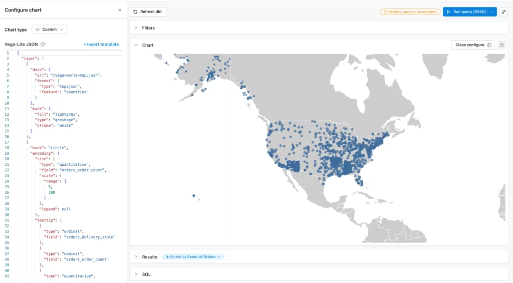
Scatterplot Maps
Maps were the final common chart type that Lightdash lacked compared to major competitor Looker. Now, with the addition of Vega-Lite, maps are incredibly customizable. Below, we demonstrate a scatterplot showing orders placed across the United States.
Vega-Lite JSON
{
  "layer": [
    {
      "data": {
        "url": "/vega-world-map.json",
        "format": {
          "type": "topojson",
          "feature": "countries"
        }
      },
      "mark": {
        "fill": "lightgray",
        "type": "geoshape",
        "stroke": "white"
      }
    },
    {
      "mark": "circle",
      "encoding": {
        "size": {
          "type": "quantitative",
          "field": "orders_order_count",
          "scale": {
            "range": [5, 100]
          },
          "legend": null
        },
        "tooltip": [
          {
            "type": "ordinal",
            "field": "orders_delivery_state"
          },
          {
            "type": "nominal",
            "field": "orders_order_count"
          },
          {
            "type": "quantitative",
            "field": "orders_delivery_latitude"
          },
          {
            "type": "quantitative",
            "field": "orders_delivery_longitude"
          }
        ],
        "latitude": {
          "type": "quantitative",
          "field": "orders_delivery_latitude"
        },
        "longitude": {
          "type": "quantitative",
          "field": "orders_delivery_longitude"
        }
      }
    }
  ],
  "projection": {
    "type": "mercator",
    "scale": 400,
    "center": [-100, 40],
    "_comment": "change scale and center to zoom into a region"
  }
}
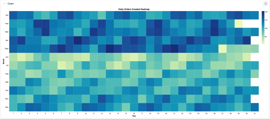
Heatmaps
Heatmaps offer a powerful way to visualize density and patterns. Below, we feature a unique heatmap designed to reveal daily order seasonality. This rectangular grid uses months as rows and days of the month as columns. The color intensity within each cell represents the number of orders placed on that specific day, making it an effective tool for identifying seasonal trends at a glance.
Vega-Lite JSON
{
  "$schema": "https://vega.github.io/schema/vega-lite/v6.json",
  "title": "Daily Orders Created Heatmap",
  "config": {
    "view": {
      "strokeWidth": 0,
      "step": 13
    },
    "axis": {
      "domain": false
    }
  },
  "mark": "rect",
  "encoding": {
    "x": {
      "field": "orders_created_at_day",
      "timeUnit": "date",
      "type": "ordinal",
      "title": "Day",
      "axis": {
        "labelAngle": 0,
        "format": "%e"
      }
    },
    "y": {
      "field": "orders_created_at_day",
      "timeUnit": "month",
      "type": "ordinal",
      "title": "Month"
    },
    "color": {
      "field": "orders_order_count",
      "aggregate": "max",
      "type": "quantitative",
      "legend": {
        "title": null
      }
    }
  }
}
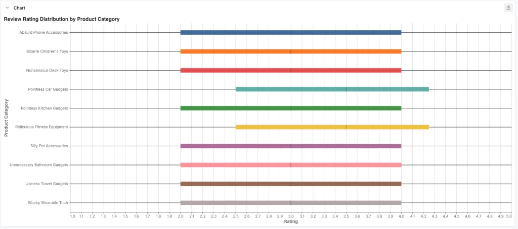
Box plots
Vega-Lite also supports box plots. Below is a box plot showing the review rating distribution for products by product category. With a quick glance, you can see which categories have consistently high ratings, which have a wider range of opinions.
Vega-Lite JSON
{
  "mark": {
    "type": "boxplot",
    "extent": "min-max",
    "median": {
      "color": "#2c3e50"
    }
  },
  "title": {
    "text": "Review Rating Distribution by Product Category",
    "color": "#333",
    "anchor": "start",
    "fontSize": 16
  },
  "width": 500,
  "config": {
    "axis": {
      "labelFont": "Inter",
      "titleFont": "Inter",
      "labelFontSize": 12,
      "titleFontSize": 14
    },
    "view": {
      "stroke": "transparent"
    }
  },
  "$schema": "https://vega.github.io/schema/vega-lite/v6.json",
  "encoding": {
    "x": {
      "axis": {
        "title": "Rating",
        "labelColor": "#6e7079",
        "titleColor": "#6e7079"
      },
      "type": "quantitative",
      "field": "reviews_rating",
      "scale": {
        "zero": false
      }
    },
    "y": {
      "axis": {
        "title": "Product Category",
        "labelAngle": 0,
        "labelColor": "#6e7079",
        "labelLimit": 200,
        "titleColor": "#6e7079"
      },
      "type": "nominal",
      "field": "products_category"
    },
    "color": {
      "type": "nominal",
      "field": "products_category",
      "scale": {
        "scheme": "tableau10"
      },
      "legend": null
    },
    "tooltip": [
      {
        "type": "nominal",
        "field": "products_category"
      },
      {
        "type": "quantitative",
        "field": "reviews_rating"
      }
    ]
  },
  "description": "Box plot of review ratings across product categories."
}
Ready to try the new features? If you’re already hosted by Driftwave, we’ve got you covered. If not, reach out to see how we can host Lightdash for you with all the bells and whistles without locking you in.